

A few weeks ago, President Trump took to Truth Social to declare victory over inflation. His proof? Walmart's Thanksgiving dinner was down 25% compared to last year. "AFFORDABILITY is a Republican Stronghold," he wrote.
It sounded great. There was just one problem: it wasn't true.
The 2025 Walmart Thanksgiving basket had 15 products. Last year's had 21. They cut the pecan pie, the cranberry sauce, the sweet potatoes, the celery, the onions. They swapped name brands for Great Value store brands.
As one NYU economist put it: "It is very unlikely that a typical household's Thanksgiving shopping trip costs them 25% less than last year, unless they are feeding 25% fewer people."
This is the game. Change the basket. Swap the methodology. Declare victory. And hope nobody checks the math.
I built Charted Interest because I'm tired of being told one thing while seeing another.
Why I'm Doing This
I've spent years studying the gap between what politicians say about the economy and what the numbers actually show.
Here's what I've learned: the gap is wide, and it's not an accident.
We're constantly told that inflation is cooling, that the economy is strong, that working families are better off than they were. Maybe some of that is true in aggregate. But aggregates hide a lot. They smooth over the things that actually hit your wallet: the price of eggs, the cost of filling your tank, the rent check that keeps climbing even when the CPI says housing is "stabilizing."
Data doesn't have an agenda. Politicians do. Pundits do. But the numbers, when you look at them honestly, tell you what's actually happening.
Economics talks about the invisible hand of the market. I want to make the invisible visible. I'm calling this project "The Visible Hand." My goal is simple: take publicly available economic data and present it in a way that cuts through the noise. No spin. No cherry-picked comparisons. Just the raw reality of what things cost and how that's changed over time.
Introducing the Breakfast Index
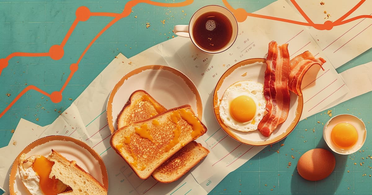

So where do you start when you want to track "real" inflation? The stuff people actually feel?
I started with breakfast.
Why breakfast? Because it's universal. Almost everyone eats it. The items are simple and familiar: eggs, bacon, toast, butter, coffee, orange juice. You don't need an economics degree to understand what these things cost. You buy them every week. You feel the price changes in real time.
The Breakfast Index is the first dashboard on Charted Interest. It tracks the cost of a classic American breakfast from 1980 to today, using price data from the Federal Reserve Economic Data (FRED) database. Every item is measured in single servings: two eggs, two slices of bacon, two slices of toast, a pat of butter, a cup of coffee, a glass of OJ.
The dashboard is interactive. You can add items (want pancakes? steak? a mimosa?) or remove them. You can see how each individual ingredient has changed over time. You can watch the "receipt" update in real time as you build your own breakfast.
Here's why that matters: inflation isn't one number. It's dozens of numbers, all moving in different directions. Some items spike. Others drop. The overall CPI might tell you inflation is at 3%, but your specific grocery cart could be up 8% or down 2% depending on what you buy. The Breakfast Index lets you see that variation for yourself.
I wanted to build something that felt tangible. Not another abstract chart, but something that connects to your actual life. When you see that your breakfast cost 82 cents in 1980 and costs $3.19 today, that lands differently than hearing "cumulative inflation since 1980 is 280%."
Same math. Different feeling.
What the Data Shows
Coffee is up 41% year-over-year. That's not a typo.
The default breakfast on the dashboard (eggs, bacon, toast, butter, coffee, OJ) costs $3.19 today. That same meal cost $3.01 a year ago. And in January 1980, it cost 82 cents.
That's a 6% increase year-over-year. Not catastrophic, but not "inflation is over" either.
But the real story is in the individual items. Here's what's happening beneath the surface:
Coffee is the big story. Your morning cup costs nearly half again what it did last year. Global supply issues (droughts in Brazil, production problems in Vietnam) are squeezing the market. You're feeling it at the grocery store and at the café.
Eggs are down 9%. Finally, some relief. After the avian flu crisis sent egg prices through the roof in 2022-2023, they've stabilized. If you lived through the $7 dozen eggs era, your grocery bill is a little lighter now.
Orange juice is up 12%. Another supply chain story. Citrus greening disease has devastated Florida groves. Frozen OJ concentrate keeps climbing.
And if you add steak to your breakfast? Beef is up 20% year-over-year. A 6oz sirloin that cost $4.42 last year now runs $5.30.
This is what I mean when I say inflation isn't one number. The official CPI might say inflation is moderating. And maybe, in aggregate, it is. But "moderate" inflation in coffee, juice, and beef can still wreck your monthly budget. The Breakfast Index shows you the texture that the headline numbers hide.
What's Next
This is the first post from Charted Interest, and the Breakfast Index is just the beginning.
In the next edition of The Wire, I'm going to dig deeper into the "why" behind these numbers. Why is coffee spiking? What's driving protein prices up while eggs come down? And what does the policy landscape (tariffs, trade agreements, agricultural subsidies) have to do with what you pay at the register?
I'll also be building more dashboards. The cost of housing. The price of healthcare. The gap between wages and productivity. There's a lot of ground to cover, and I plan to cover it with the same approach: raw data, honest analysis, and tools that let you explore the numbers yourself.
For now, I'd encourage you to play with the Breakfast Index. Build your own breakfast. Add the pancakes. Throw in the steak. See how your choices change the picture. That's the whole point: this isn't about me telling you what to think. It's about giving you the data to see for yourself.
Stay Connected
Share this with someone who's felt the squeeze at the grocery store and wondered if they were imagining things.
You're not. The data is right there.
Let's chart it together.